Valley Hope Brand Design
LOGO UPDATE + BRAND REFRESH + Comprehensive website update + Digital and print assets
About Valley Hope
Valley Hope is a national addiction treatment provider that has been helping patients and their families since 1967. The care at Valley Hope is patient-centered and customized to the individual’s needs.
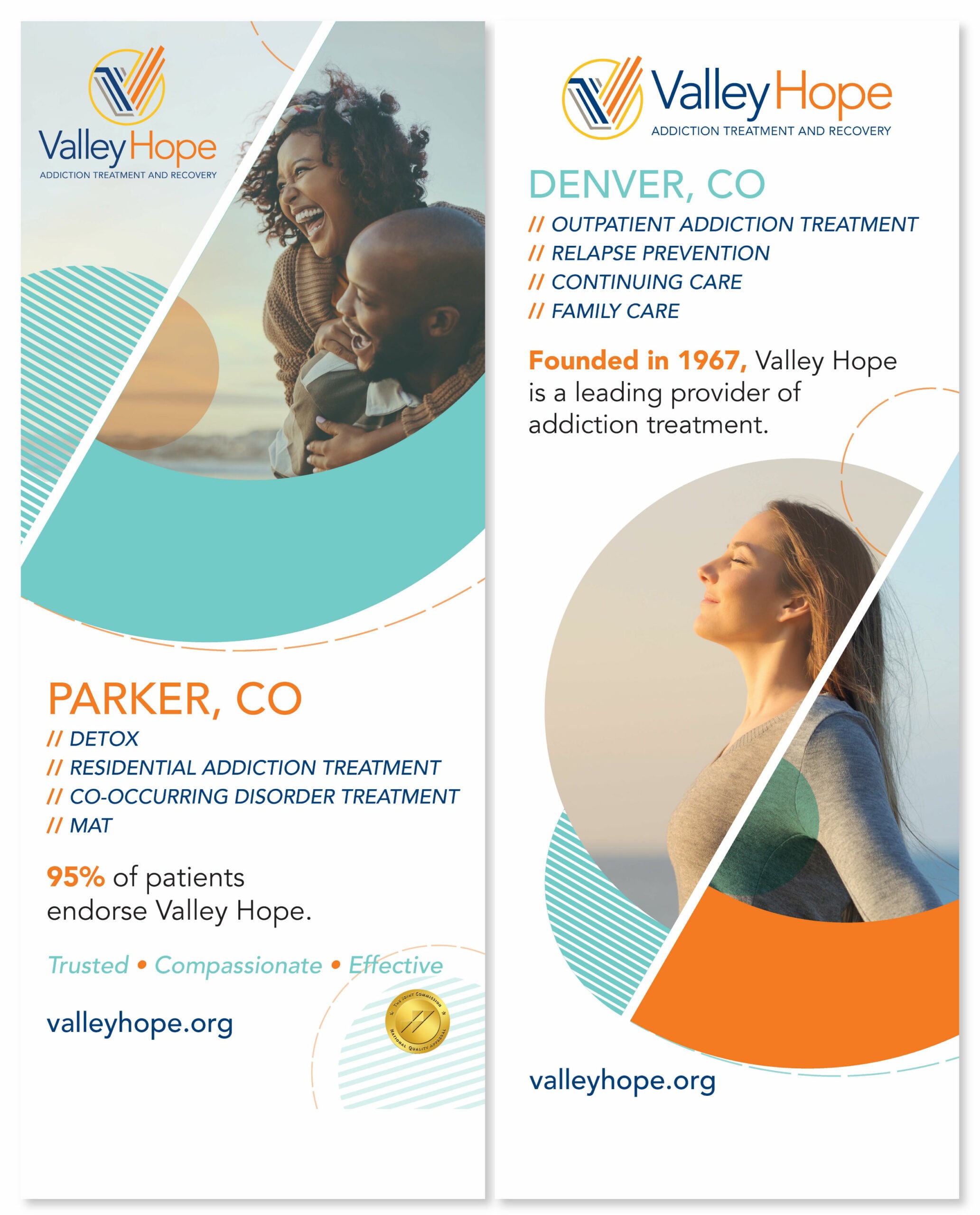
Valley Hope has 14 locations in 6 states. The residential facilities are typically located in rural settings, while the outpatient facilities are typically located in cities. Every treatment center provides safe and comfortable environments that foster healing.
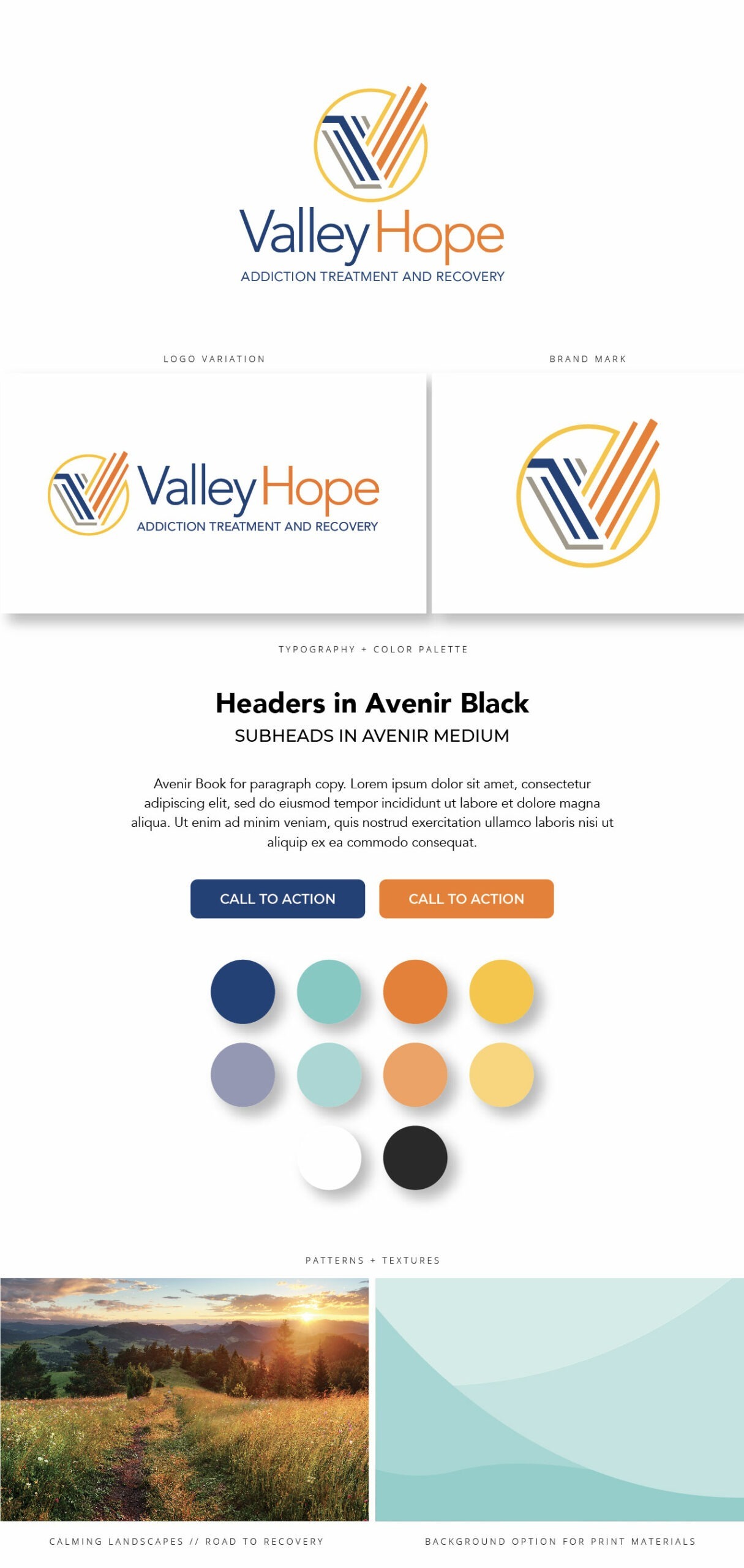
About the Brand
Over the course of Valley Hope’s 55+ years, they underwent a single rebranding. This update introduced the symbolic “V” icon logo: the left side is blue and gray, which conveys the downward slide of addiction, descending to a hard bottom. Rising upward to the right are strong, bold lines of orange and gold representing the warmth and compassion of their counselors and staff, and the promise of a bright future. Their brand conveys freedom and empowerment.
Challenges: Although Valley Hope has been around for decades, the addiction treatment scene has changed drastically. With increased competition, they were focused on carving out their foothold in the addiction treatment space.
Project details:
- We added the identifier “Addiction Treatment and Recovery” underneath the logo to announce who they are and what they do at a glance.
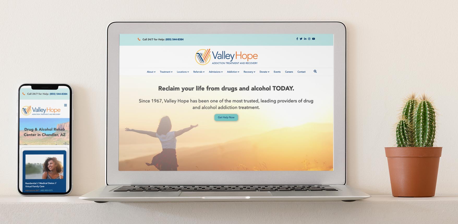
- Complete overhaul of the website. The previous version had worked well for a few years, but became outdated and needed love. The navigation became an incredibly important factor in this refresh. On the previous site, it was difficult for users to find what they were looking for due to the naming conventions and cluttered interface. We wanted prospective patients or their families to find access to the care that they need as quickly as possible. Our goal for the business was to acquire more quality leads and increase name recognition.
- We did landing page testing, A/B testing, and other research methods after launch to inform any changes on design or content strategy.
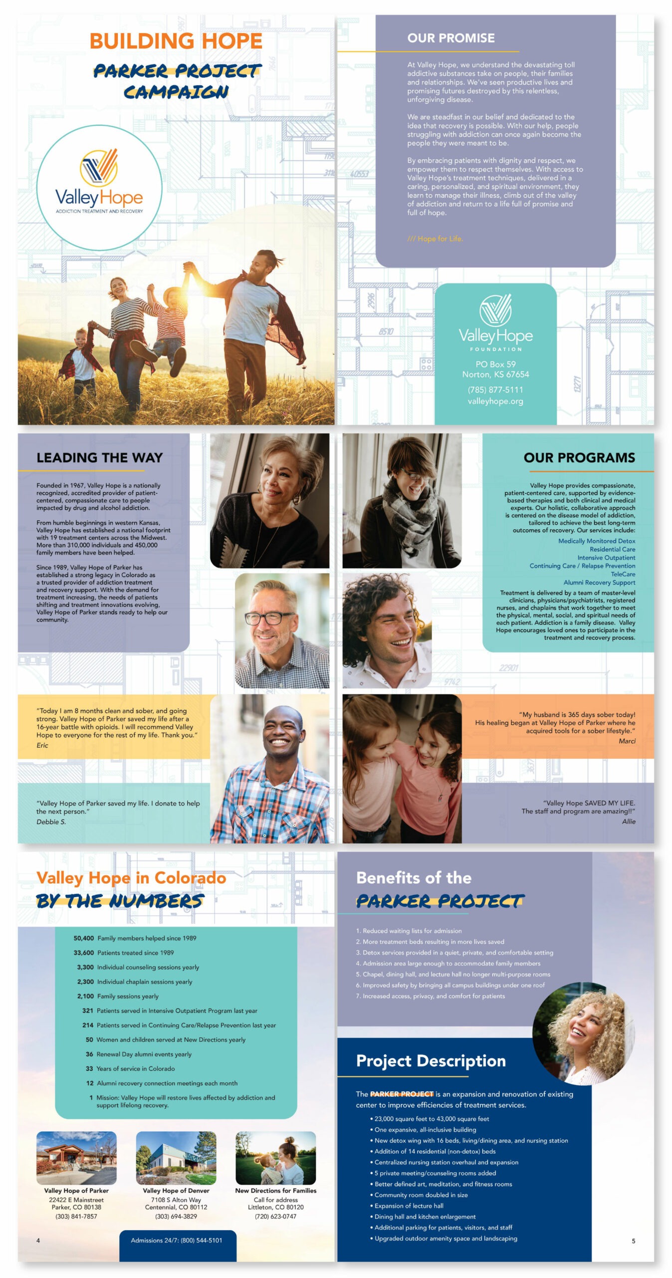
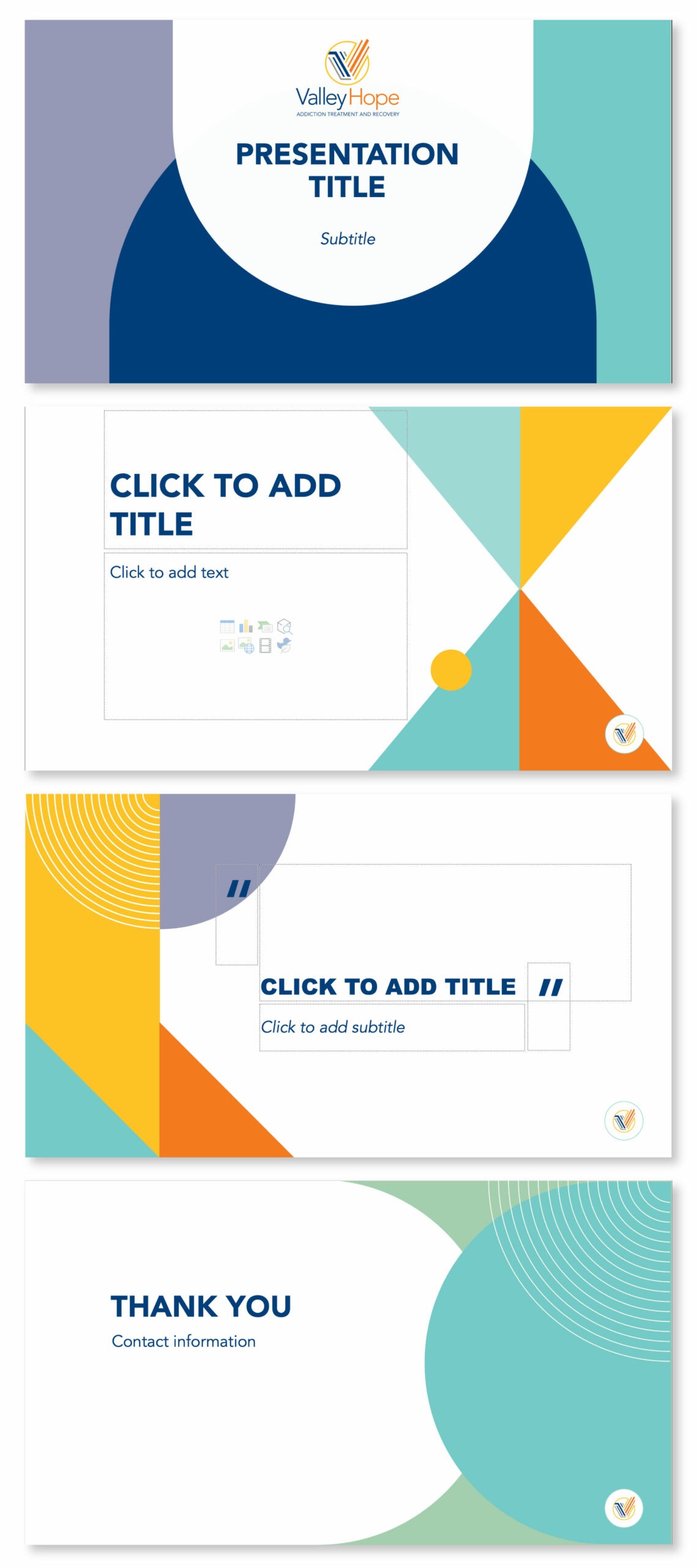
- Creation of assets such as letterhead, business cards, flyers, brochures, videos for referral sources, billboards, PowerPoint templates, Word templates, case statements, conference materials, and more!
Wins: The redesign increased direct users by 594% year-over-year, increased page speed by 30% year-over-year, and increased average time on page by 187% year-over-year.
Does your business need a branding makeover?
Let’s take your brand design to the next level!